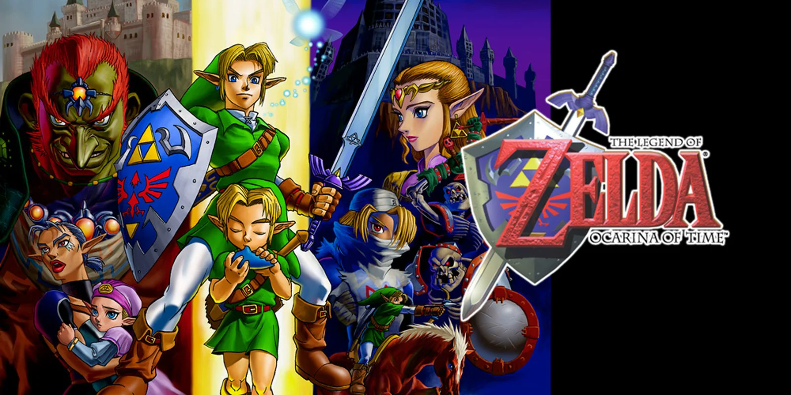
Game review
The Legend of Zelda: Ocarina of Time
9.5 / 10
- Developer
- Nintendo EAD
- Publisher
- Nintendo
- Released
- 21 November 1998
- Platforms
- Nintendo 64 (1998); GameCube (2002-2003, via bonus disc/Collector's Edition); Wii and Wii U Virtual Console; Nintendo 3DS (Ocarina of Time 3D, 2011); Nintendo Switch Online + Expansion Pack (N64 app)
- Genre
- Action-Adventure
- Monetisation
- Originally a one-off cartridge purchase. Today it is reachable two ways — buy the standalone Ocarina of Time 3D cartridge/eShop download outright, or play the original N64 build as part of a Nintendo Switch Online + Expansion Pack subscription, with no further purchase inside the game either way
- Players
- Single-player only
The short version
Ocarina of Time earns a 9.5 because it didn't just bring a beloved 2D formula into 3D, it worked out the actual grammar 3D action-adventure games would use for the next quarter-century, and got so much of it right on the first attempt that the industry never seriously tried an alternative. Z-targeting solved 3D melee combat. The context-sensitive action button solved the control-scheme bloat that early 3D games were drowning in. Dungeon items turned equipment into a second key that reopens the whole map. The ocarina turned travel and puzzle-solving into the same interface. None of that reads as ambitious now because it's the default — which is exactly the point.
It stops short of a perfect score because its rough edges materially affect play: a camera that fights tight interiors, an item-swap system on N64 that interrupts combat to open a menu, a Water Temple whose reputation for confusion is earned, an escort-quest companion who won't stop asking if you've noticed the thing you're looking at, and a back half that recycles more of its own map than the front half does. Its architecture remains extraordinary; the moment-to-moment experience is not flawless.
Biggest strengths
- Z-targeting turns 3D melee combat from a camera-fighting mess into a system that still underlies nearly every action game with a lock-on button
- The context-sensitive A button collapses jump, talk, open, push, and pick up into one control, keeping the N64 pad's already-crowded layout usable
- Every dungeon item is also a permanent new verb for the overworld, so finishing a dungeon quietly reopens areas you'd already walked past
Biggest weaknesses
- Swapping equipped items on the N64 original opens a full pause menu, which stops combat and puzzle momentum dead — fixed by touchscreen quick-swap on 3DS
- Interior camera framing in tight rooms and corridors fights the player more than the exploration ever should, even accounting for the era
- The Water Temple's raised-and-lowered water levels combined with mid-dungeon boot-swapping produced a genuinely disorienting puzzle that the 3DS version had to simplify
Who it's for: Players curious why every 3D action-adventure since 1998 targets enemies, contextualises its action button and treats equipment as a key to old areas the same way — and anyone willing to meet a 27-year-old game on its own terms rather than modern control conventions
Our recommendation: Play Ocarina of Time 3D if you can find a copy — it fixes the item-swap friction, redraws the world at triple the polygon count and lets you fight the whole boss roster back to back, at the cost of a flattened, arguably over-simplified Water Temple. Play the Nintendo Switch Online N64 version if you want the unfiltered original and already pay for the Expansion Pack tier; it costs nothing extra and needs no separate purchase.
9.5 / 10
Twenty-eight years on, it's easy to undersell what Ocarina of Time actually did, because the things it invented stopped looking like inventions decades ago. Lock onto an enemy and strafe around it: normal. Press one button to open a door, talk to a villager, or pick up a rock, and let context sort out which: normal. Get an item in a dungeon and immediately think of three places in the overworld it now unlocks: normal. None of that was normal in November 1998. Three-dimensional action games existed before this one, but none of them had solved the basic problem of fighting, aiming, and navigating a camera at the same time with a control pad that had nowhere near enough buttons for the job. Ocarina of Time solved it, on the first serious attempt, well enough that the solution simply became the genre's grammar. That's the argument for one of the highest scores in this library, and it's worth making on design terms rather than reputation, because the reputation followed the design, not the other way around.
Z-targeting: the actual invention
Point a joystick-driven camera at a moving enemy while also aiming an attack, in 1998, on a controller with one analog stick, and you get chaos — the camera drifts, the player overcorrects, and combat becomes a fight against the interface before it's a fight against the enemy. Z-targeting is Ocarina of Time's answer, and it's a small idea with enormous consequences: hold a shoulder button, the camera locks onto the nearest hostile target, Link's movement re-orients around that target instead of around a fixed forward direction, and the player is now free to strafe, circle, and time an attack without also steering a camera.
That single mechanical decision is why the game's combat holds up at all on a control scheme this sparse — one attack button, no dedicated dodge, no combo system. Difficulty comes from reading attack windups and choosing when to close distance, not from a deep moveset, and Z-targeting is what makes that readable in the first place. It's also the reason the phrase "lock-on" barely needs explaining to anyone who has played a 3D action game made after this one. Devil May Cry has it. Dark Souls has it. God of War has it. None of them reinvented it, because there wasn't a better idea to replace it with — they inherited Ocarina of Time's answer to a problem the genre hadn't solved until this game shipped.
One button, read in context
The N64 pad has a face button, three C-buttons usually reserved for the camera, and two shoulder triggers. That is not a generous budget for a game that wants Link to attack, jump, open chests, push blocks, read signs, talk to villagers, pick things up, and grab ledges. Ocarina of Time's answer was to stop assigning fixed verbs to buttons and instead make the A button contextual: an on-screen icon tells the player what it will do right now, and it changes constantly based on what Link is standing near or facing. Near a ledge, it climbs. Near an NPC, it talks. Near a pushable block, it pushes. The button never changes; its meaning does.
This sounds obvious in 2026 because every third-person action game since has shipped some version of it — an interact prompt that swaps contextually as the camera and position change. In 1998 it was the thing that kept a control scheme this sparse from either running out of buttons or forcing the player to memorize a dozen fixed assignments. It's a UI decision as much as a control decision, and it's one of the clearest examples in the whole game of solving a hardware constraint so cleanly that the solution outlived the hardware by decades.
Dungeon items as a second key to the map
Zelda as a series already understood, going back to the original NES game, that an item found in one dungeon can unlock a door in another area entirely — that's the backbone of the "metroidvania" structure years before that word existed. What Ocarina of Time does with the idea in 3D is make it spatial and legible in a way 2D never quite achieved: the hookshot doesn't just open a specific door, it changes how the player reads every ledge, gap and chest in the overworld from that point forward, because now those gaps are a question — can I reach that with what I'm currently carrying — instead of scenery. Bombs turn cracked walls into doors. The Longshot, found deep in the back half of the game, turns huge gaps across all of Hyrule into crossable space retroactively.
The result is that finishing a dungeon does two things at once: it clears that dungeon, and it quietly re-teaches the player how to read the entire world they've already walked through. That's a more elegant form of gating than a level-gated door or a locked map region, because the player doesn't need a quest marker to know where to go back — the item itself tells them, just by making previously dead-end geography look different. Modern open-world design still leans on this pattern constantly, usually with a grapple hook or a double-jump standing in for the hookshot, and it's tracing the same idea back to this game and, before it, this series.
The ocarina as an interface, not a gimmick
An item that plays music could easily have been decorative — a nice bit of flavour with one or two scripted uses. Instead the ocarina does three structurally different jobs with the same input method, and that overlap is the whole trick. Certain songs are fast travel, warping Link to fixed points across a map that would otherwise demand long overworld treks on foot or horseback. Certain songs are keys, opening specific doors, changing the time of day, or altering weather to solve a specific puzzle. And certain songs are narrative beats, taught to Link by other characters at specific story moments, so learning a new melody often doubles as a small character scene.
Folding fast travel, environmental puzzle-solving and story delivery into one shared object, played with the same simple call-and-response input every time, is a genuinely uncommon piece of interface design. Most games since have kept those three systems separate — a map screen for travel, a key-item inventory for puzzles, cutscenes for story beats. Ocarina of Time collapses them into a single diegetic instrument the player physically plays, and it's one of the few ideas in this review that hasn't been widely copied in the exact form it appeared here, which if anything strengthens rather than weakens the case for its originality.
Child, adult, one map read twice
The seven-year time skip at the game's midpoint is the structural decision that makes everything else pay off. Link spends the first half of the game as a child, too small and weak to wield the Master Sword or fight several late-game enemies, and the second half as an adult who returns to find the same Hyrule reshaped by seven years under Ganondorf's rule. Crucially, it's the same map both times, not two separate regions — Kokiri Forest, Hyrule Field, Kakariko Village and more all exist in both timeframes, altered by what's happened between them.
That's an efficient piece of game design dressed up as a story device: building one Hyrule and having the player experience it twice, at two different physical scales with two different ability sets, effectively doubles the perceived size of the world without doubling the amount of geometry that had to be built and tested. It also lets the game teach a genuinely uncommon lesson without a tutorial prompt — that the world itself has a timeline, and the player's actions as a child are legible as history once they return as an adult. A shortcut Link can't reach as a child becomes reachable as an adult with different tools; a favor done as a child pays off, sometimes literally, as an adult. Few games since have committed to a single persistent world experienced at two different points in its own history this thoroughly, and it's a large part of why Hyrule feels like a place with a past rather than a static backdrop.
Where the seams show, honestly
None of the above is an argument that this game plays like a modern one, and the score isn't pretending it does. The N64 original's item management is the clearest casualty of its era: Link can only carry two equippable items at a time on the C-buttons, and swapping in the Iron Boots for an underwater section or the Hover Boots for a specific ledge means opening the pause menu, an action that stops the game cold mid-puzzle or mid-fight. It's a real friction point, not a minor one, and it's exactly the kind of thing a control scheme designed around one analog stick and a handful of buttons was always going to struggle with. The 3DS remaster fixes it directly, moving item selection to the touchscreen so equipment can change without pausing anything — a clean, specific improvement rather than a cosmetic one.
The camera is the other era-bound weakness. Z-targeting solves combat framing, but general exploration, especially inside tight interiors and dungeon corridors, is handled by a camera the player has limited control over, and it fights visibility often enough to be a genuine source of friction rather than a quirk to wave off. This is a game from before third-person camera design had converged on modern conventions, and it shows most in exactly the rooms where precise platforming matters.
The Water Temple deserves its reputation, and being honest about that is part of why the score stops short of perfect. Raising and lowering the room's water level changes which doors and passages are reachable, and doing that correctly requires swapping the Iron Boots on and off at specific moments — compounding the item-menu friction above with a layout that's genuinely easy to get turned around in, especially before the player has mapped which water height unlocks which route. It's the single most-cited "this hasn't aged well" complaint about the game, it's earned, and Grezzo agreed enough to simplify it directly for the 3DS version. A review that pretends this dungeon was always fine would be worse than one that lets the criticism count.
Navi, Link's fairy companion, is the other frequently-cited friction point, and it's fair: her "Hey! Listen!" prompting exists to make sure the player hasn't missed an interactive object or a plot beat, but it fires often enough, including for things already in plain view, that it reads as over-cautious hand-holding more than helpful guidance. And the adult half of the game, structurally clever as the time-skip is, does lean on reused space — Hyrule Field, Kakariko Village and other child-era locations return largely as-is rather than being replaced with proportionally new geography, so the second half of the campaign covers less genuinely new ground than the pacing implies.
Which version to actually play
Three ways to experience this game exist today, and they're not equally worth chasing. The original 1998 N64 cartridge is the historical artifact — pre-rendered low-poly Hyrule, fog-shrouded draw distance, the full item-menu friction described above — and it's the version every design claim in this review is describing, but it's genuinely rough by 2026 control standards and increasingly hard to run without original hardware.
Ocarina of Time 3D, Grezzo's 2011 remaster for Nintendo 3DS, is the version worth seeking out if a copy is findable. It rebuilds the game's pre-rendered backgrounds as real-time 3D, raises the frame rate from 20fps to 30fps, adds touchscreen item-swapping that directly fixes the pause-menu problem above, adds gyroscopic aiming for bow and slingshot sections, and bundles Master Quest — a remixed, harder version of every dungeon — plus a boss rush mode. Its one real debit against the original is that softened Water Temple, which trades some of the puzzle's disorientation for accessibility; reasonable people can disagree about whether that trade was worth making, but it's a real change, not an unambiguous improvement in every respect. It is no longer sold new, so finding one today means the secondhand cartridge market or an eShop purchase history from before Nintendo wound the storefront down.
The practical route for most readers in 2026 is the original N64 build through Nintendo Switch Online + Expansion Pack, added to the service in October 2021. It's the unfiltered original — camera quirks, item-swap menu, unmodified Water Temple and all — running on modern hardware with no extra purchase beyond the Expansion Pack tier of the subscription, which also unlocks the rest of Nintendo's N64, GameCube, Game Boy Advance and Genesis libraries. For a reader who already pays for that tier, there's no reason not to play the canonical version this review is built around. For a reader starting from zero, it's worth weighing a subscription against the one-off cost of hunting down a 3DS cartridge, since the two experiences aren't quite the same game once the touchscreen and Master Quest are factored in.
Verdict
The case for a 9.5 is that Ocarina of Time can be both foundational and visibly imperfect. Its camera struggles in tight spaces, its item-swap system was clumsy enough for the developers to rebuild later, its signature dungeon earned its reputation for confusion, and its companion's guidance overstays its welcome. Those shortcomings keep it from a 10. On the harder question — did this game solve foundational problems the entire genre was still fumbling with, and did enough of those solutions turn out to be correct that the industry adopted them wholesale — the answer is unambiguously yes. Z-targeting is still how 3D action games handle melee combat. Context-sensitive actions are still how they handle sparse control schemes. Items that reopen the map are still how progression gates get taught without a quest marker. A game that sets the terms other games are still building on, nearly three decades later, remains an all-time great without needing a perfect score.
Players building anything with persistent worlds and long-term unlocks — Wanderer included — are still working in a design language this game did more than any other single release to establish.
Pros and cons
Pros
- Z-targeting turns 3D melee combat from a camera-fighting mess into a system that still underlies nearly every action game with a lock-on button
- The context-sensitive A button collapses jump, talk, open, push, and pick up into one control, keeping the N64 pad's already-crowded layout usable
- Every dungeon item is also a permanent new verb for the overworld, so finishing a dungeon quietly reopens areas you'd already walked past
- The ocarina works simultaneously as fast travel, a puzzle key and a piece of diegetic UI, which almost no game since has matched in one object
- The child/adult structure makes one map function as two distinct games without doubling the amount of world that had to be built
- Real-time N64 cutscenes with full camera direction were unheard of in 1998 and still read as deliberately staged rather than automated
Cons
- Swapping equipped items on the N64 original opens a full pause menu, which stops combat and puzzle momentum dead — fixed by touchscreen quick-swap on 3DS
- Interior camera framing in tight rooms and corridors fights the player more than the exploration ever should, even accounting for the era
- The Water Temple's raised-and-lowered water levels combined with mid-dungeon boot-swapping produced a genuinely disorienting puzzle that the 3DS version had to simplify
- Navi's repeated "Hey! Listen!" prompting interrupts exploration to point out things a player has often already noticed
- Adult Link's half of the game reuses Hyrule Field and several child-era locations rather than introducing proportionally new space
- The remaining single-purchase route (a physical or eShop-history Ocarina of Time 3D cartridge) is no longer sold new, leaving the Switch Online subscription as the practical way in
Screenshots
-
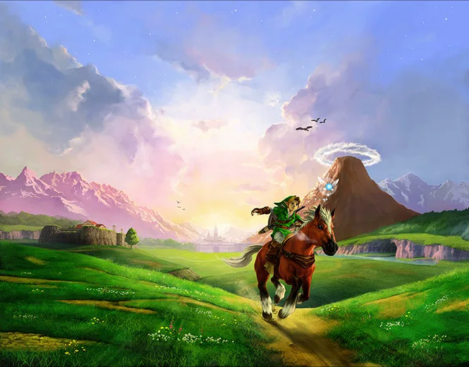
The Legend of Zelda: Ocarina of Time — original 1998 artworkArtwork: Nintendo, official Zelda history archive -
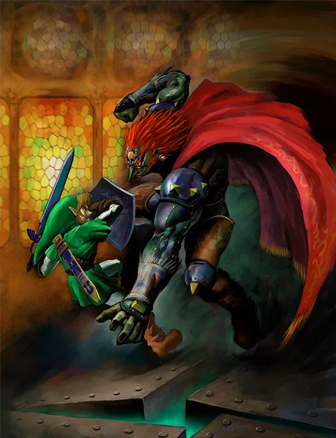
The Legend of Zelda: Ocarina of Time — original 1998 artworkArtwork: Nintendo, official Zelda history archive -
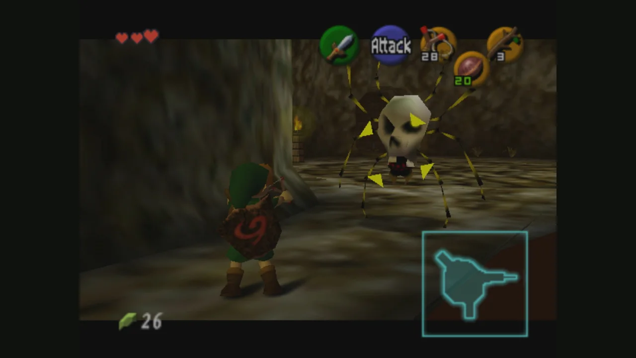
The Legend of Zelda: Ocarina of Time on Nintendo 64Screenshot: Nintendo, original Nintendo 64 version via Nintendo Europe -
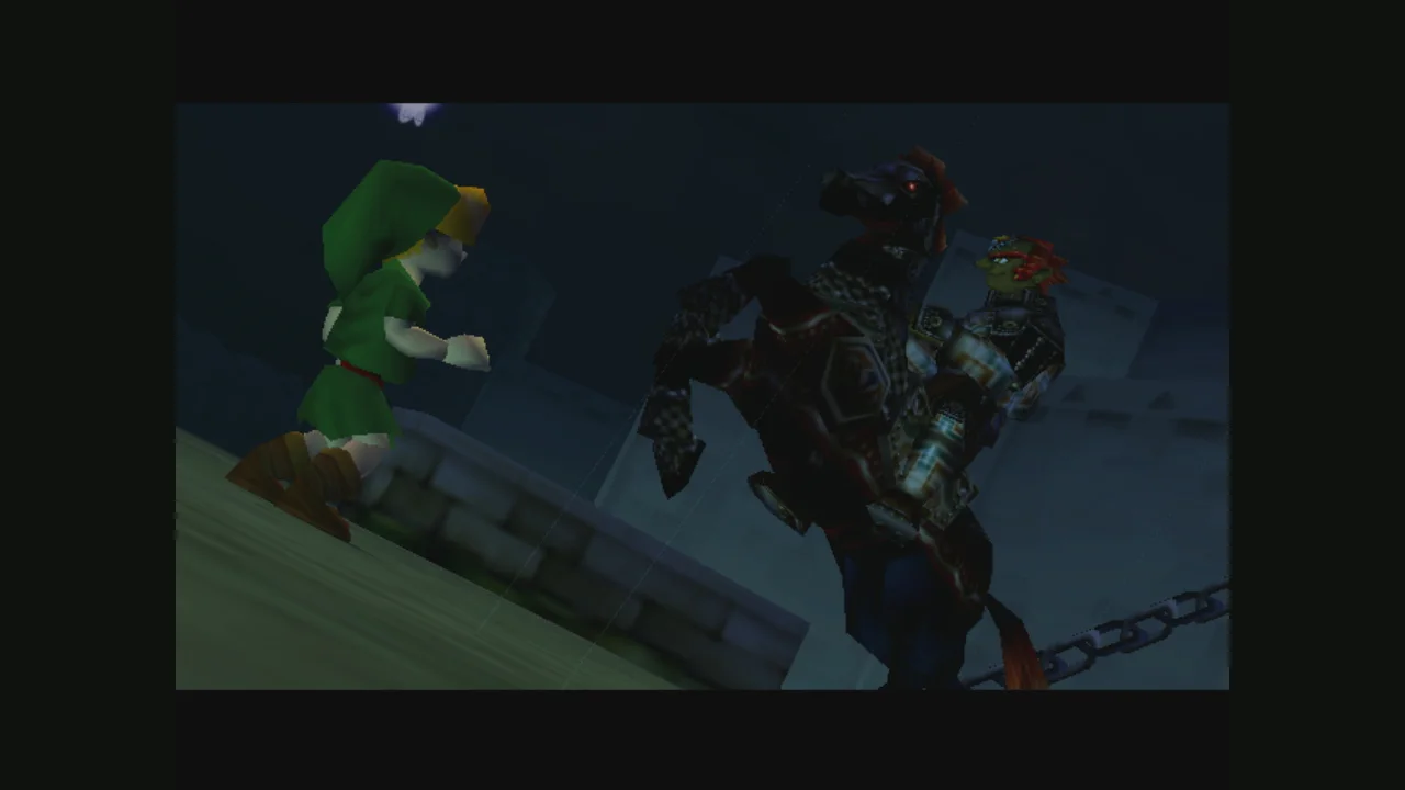
The Legend of Zelda: Ocarina of Time on Nintendo 64Screenshot: Nintendo, original Nintendo 64 version via Nintendo Europe -
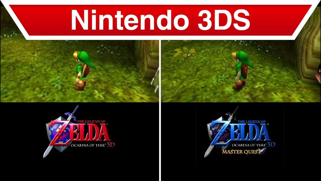
Ocarina of Time 3D (2011) — the rerelease, included here for comparisonImage: Nintendo, official Ocarina of Time 3D trailer still -
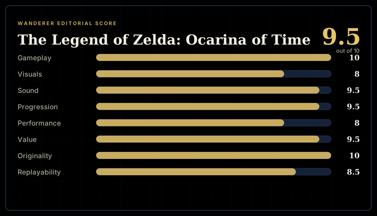
How the review scores each part of the gameWanderer Editorial -
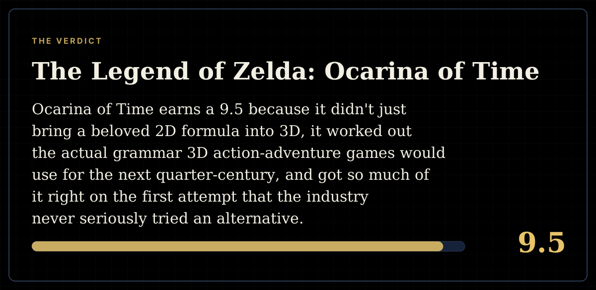
The short versionWanderer Editorial